Project 02
Improve Content Marketing
Redesign layouts and visual hierarchy to improve legibility and align with brand identity to help the user find articles with a seamless experience
Background / Challenges
The existing content on the brand website did not feel like part of the brand due to the lack of alignment to the brand design system.
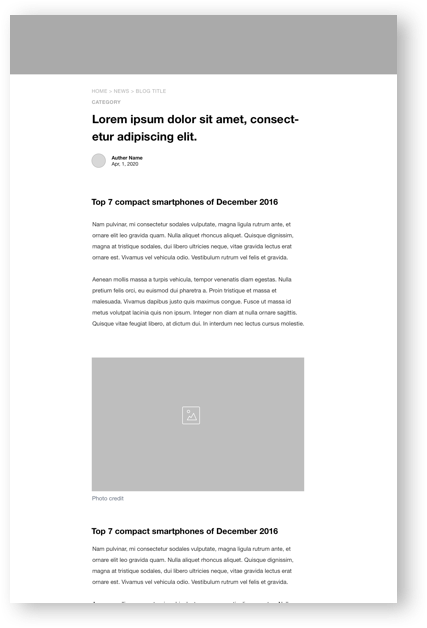
The article section did not have sufficient readability because of the inconsistent, ineffective use of spacing, typography, and design patterns.
Goals
Optimize readability through re-designing layouts and visual hierarchy, which adapts to scalability and flexibility.
Design Solutions
Redefined typographic styles, visual hierarchy, and spacing (line space, negative space, etc.)
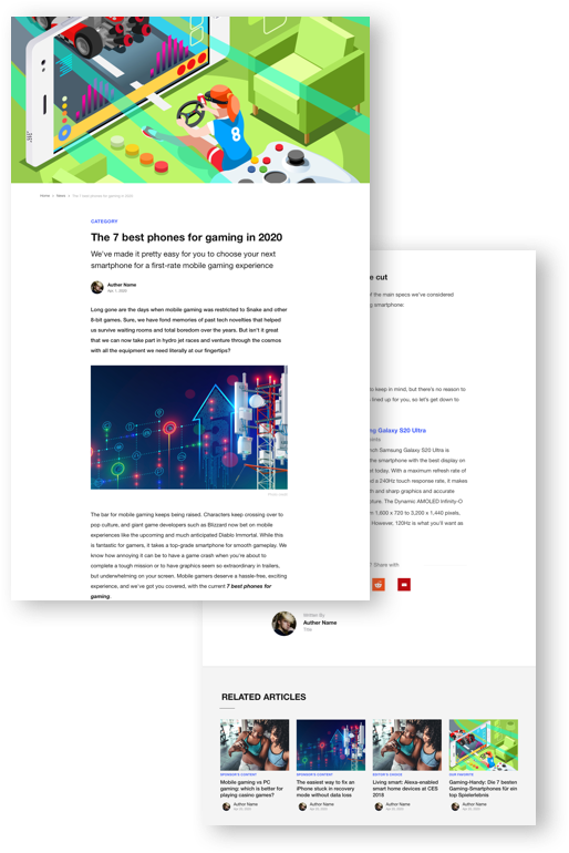
Improved cohesion through simplified measurements guidelines and clean look
Updated design system to maintain the brand identity across the pages on the platform
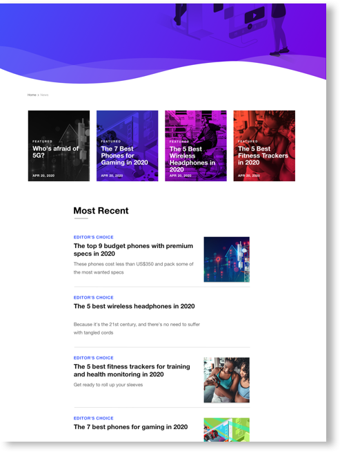
Increased usability through functionalities like related article view, sharing, categorization
Scope: List of Articles view, Single post view, single page/author view
Design is about solving problems.
In this project, I ensured the optimization of readability through consistent and effective use of space (line space, negative space, word count per line, etc) as well as a visual and typographic hierarchy.


